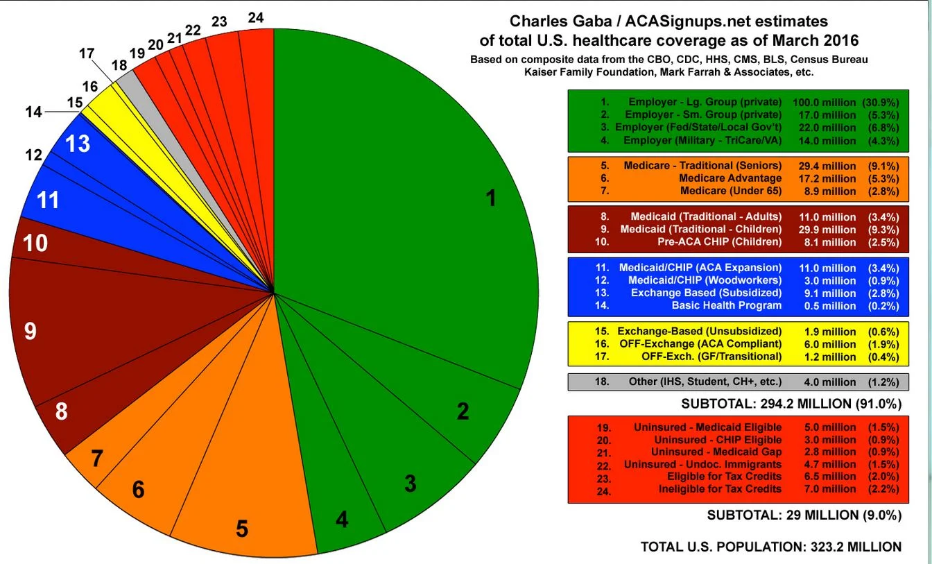
Have you ever wondered how many people in the US are covered by health insurance provided through their employer? Or by Medicare? Or how many people purchase policies through the Affordable Care Act state health insurance exchanges?
The colorful pie chart below answers these questions and more.

